How to Write Curved Text Over Image Online for Free
If your text looks boring, the problem is shape. Not font. Not color. Shape.
Most people try to fix text by changing fonts, adding shadows, or playing with colors. They spend hours scrolling through thousands of typefaces. They tweak hex codes. They add glows. They think the "vibe" is in the pixels.
That helps a little. But the real problem is usually structure. It is the geometry of the layout.
Straight text is rigid. It is a box. It is predictable. Static. It feels like an afterthought—something slapped onto a photo because it had to be there.
Curved text moves with the image. It flows. It has energy. It respects the subject matter instead of ignoring it.
The FreeToolio Add Text Tool lets you write curved text directly on your image, right in your browser, without installing anything. It turns a flat message into a design element.
Open Add Text Tool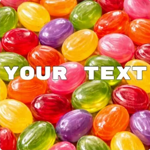
What curved text means
Curved text means your text follows a path. Not a straight line. Not a rigid block. A path.
In traditional word processors, text is a grid. It starts at the left margin and ends at the right. This is fine for an essay. It is terrible for a design.
You can bend it into a circle, an arc, or a custom curve that wraps around objects. The text becomes part of the composition instead of sitting on top of it. It stops being "words on a picture" and starts being "an image containing words."
This is used in logos, badges, stamps, packaging, and any design where straight text feels too mechanical. Curved text introduces flow. And flow is what makes designs feel natural. It mimics the way we see the world—not through flat planes, but through shapes and perspectives.
When text curves, it gains a third dimension. It feels like it has weight. Like it occupies space. That is the secret of high-end branding.
Key idea: Shape controls how text feels. Straight is information. Curved is emotion.
Why curved text works better than straight text
Straight text fights the image. This is a battle you don't want to fight.
Images are rarely made of straight lines. Look at a photo of a person. A landscape. A piece of fruit. Everything is a curve. Shadows have curves. Horizons have curves. Human faces are nothing but curves.
When you place straight text on top, it ignores all of that. It slices through the image like a knife. It breaks the immersion. It tells the viewer's brain: "This part is real, and this part was typed in an editor."
Curved text adapts. It follows the structure of the image instead of breaking it. It acts as a frame. It guides the eye. It creates harmony.
Harmony is what makes something look professional. It is the invisible glue that holds a design together. Even simple designs look better when the text matches the flow of the image. It looks intentional. It looks like you spent hours in a studio, even if you only spent thirty seconds in a browser.
The Psychology of the Curve
There is a reason the most famous logos in the world—Starbucks, BMW, NASA—use curved text. It’s not just a trend. It’s science.
Humans are programmed to avoid sharp edges. We find curves soothing. A circle represents unity. It represents completion. When you wrap text into a circle, you are creating a "shield" for your brand. You are enclosing your message in a shape that feels safe and balanced.
Straight text feels like a command. Curved text feels like an invitation. If you are selling a lifestyle, a product, or a personality, you want the invitation. You want the user to feel at home in the design. You want them to "circulate" their eyes around the frame instead of hitting a corner and bouncing off.
Why this is better than normal text tools
Most tools just place text. That is basic. That is what every free app on your phone does. You type something, drag it somewhere, change it to red, and that’s it. You are left with a flat result.
This tool gives you control over the radius. That changes everything. It turns your browser into a layout engine.
- Wrap text around logos or objects: Make your text hug a coffee cup or a person's shoulder.
- Create circular text for badges: The classic "Established in 1995" look that needs perfect geometry.
- Design stamps and emblems: High-impact graphics for social media or print.
- Match text to image composition: If the subject is leaning left, the text should lean with it.
- Follow curves of objects or faces: Use the text as a highlight or a contour line.
This is not just text placement. This is layout control. And layout is what separates professional design from random editing. It’s the difference between a "meme" and a "marketing asset."
The Physics of Curving: Radius and Arc
When we talk about curved text, we are talking about two things: the center point and the radius. The tool handles the math, but you need to understand the vision.
The radius is the distance from the imaginary center of your circle to the letters. A large radius means a gentle curve—almost straight, just enough to feel organic. A small radius means a tight curve—aggressive, circular, and dense.
If you have a large subject in the center, you need a large radius to wrap around it. If you have a small icon, you need a tight radius to frame it. The "arc" is how much of the circle you fill. You can do a 180-degree half-moon or a full 360-degree loop. The tool gives you the slider to decide. Don't guess. Slide it until the letters look like they "belong" to the image beneath them.
How to use it: Step by Step
The process is built for speed. No layers. No complex menus. Just results.
- Upload your image: High resolution is better. It keeps the letters crisp.
- Type your text: Start with the core message. Don't worry about the curve yet.
- Adjust the curve: Use the slider to find the bend. Watch the letters pivot.
- Adjust size: Bigger isn't always better. Sometimes smaller text with more spacing feels more premium.
- Adjust rotation: Spin the whole arc. Maybe you want the text at the bottom. Maybe at 2 o'clock.
- Adjust position: Drag the whole thing until it frames your subject perfectly.
Keep it simple. Small changes make a big difference. One degree of curve can completely change how the text feels. If it feels "stiff," add a tiny bit more curve. If it looks "cluttered," reduce the curve.
What this tool actually does technically
Most editors "distort" text to make it curve. They stretch the letters. They pull the pixels. This makes the text look blurry and weird. It ruins the font's integrity.
Our tool does it differently. It calculates the position and rotation of each individual letter along a mathematical path. The letters aren't distorted; they are just placed at different angles. This keeps the font looking exactly how the designer intended. It stays sharp. It stays readable. It stays professional.
This is called "Text on a Path." It used to be a feature only found in expensive desktop software. Now, it runs on your laptop's browser using basic hardware acceleration. It’s clean, it’s fast, and it’s mathematically perfect.
Real use cases for Curving Text
Logos → Text around circles or icons. Look at any university seal or vintage shop logo. The text frames the center. It creates a "container" for the brand. Without the curve, the logo feels like a loose collection of parts. With the curve, it feels like a unified mark.
Watermarks → Curved text across an image without blocking the subject. Straight watermarks are ugly. They look like a "Do Not Copy" stamp on a legal document. A curved watermark following the edge of the image looks like a designer's signature. It protects your work without ruining it.
Social Media → More dynamic layouts for Instagram Stories or Pinterest Pins. Posts with curved text stand out in a feed full of rectangles. They look "designed." They look like you hired a pro. It breaks the vertical scrolling monotony and catches the thumb.
Print Design → Badges, labels, stamps, stickers. If you are printing a round sticker, you must use curved text. Straight text on a round sticker leaves wasted space in the corners (which don't exist) and looks like a mistake. Curved text maximizes the "real estate" of the sticker.
Product Images → Wrapping text around a bottle, a ball, or a person’s head. This creates a "wrap-around" effect that mimics 3D. It makes the text feel like it’s actually stuck to the object in the photo. It’s an easy way to make mockups look realistic.
YouTube Thumbnails → Use an arc to frame your face or the main object of the video. It draws the viewer’s eye toward the center. It acts as a visual funnel. More clicks. More views.
Composition Theory: Leading the Eye
Design is the art of controlling where someone looks. You are the conductor. Curved text is a "leading line." When someone sees a curve, their brain automatically wants to follow it to the end. You can use this to your advantage.
If your subject is on the right side of the photo, curve your text from the left toward the right. You are literally pointing at the subject with your words. If you want the viewer to look at the center, wrap the text around the center. You are creating a visual bullseye. Straight text doesn't do this. Straight text just sits there. Curved text directs traffic.
Common mistakes to avoid
Overcurving the text: This is the biggest mistake people make when they get a new tool. They turn the curve up to 100%. If the letters are overlapping or upside down, stop. If the curve is too strong, readability dies. If people can't read it, it's not a design—it's a mess.
Ignoring readability: Design is not just about looking good. It is about communication. If you choose a "handwritten" font and then curve it 180 degrees, no one can read it. Use clean, bold fonts for heavy curves. Save the fancy fonts for gentle arcs.
Wrong placement: If your text crosses through someone's eyes or covers the main product, you’ve failed. Text should live in the "white space" or "negative space" of an image. Use the curve to find that space. A curve allows you to sneak text into corners that straight lines can't reach.
Too many effects: Curved text is already a major visual element. It’s "loud." If you add a drop shadow, an outline, a gradient, and a glow, it becomes "noisy." Pick one effect. Usually, just a clean color is enough when the shape is this strong.
Wrong curve direction: If everything in your photo is curving "up" (like a smile), don't curve your text "down" (like a frown). This creates "visual dissonance." It makes the viewer feel like something is wrong, even if they can't explain why. Match the mood of the image.
Pro tips for the perfect curve
Start with low curve: Don't move the slider to the end immediately. Start at 0 and slowly slide up. Watch how the text interacts with the background. Sometimes, a 5% curve is more powerful than a 50% curve because it’s subtle. Subtlety looks expensive.
Follow the subject: If your image has a circular object—a plate, a tire, a moon—match its radius exactly. This creates an "integrated" look. It makes the text look like it was photographed with the object.
Use spacing carefully: Curved text naturally pushes letters closer together on the inside and further apart on the outside. You may need to adjust the "letter spacing" (kerning) to make it look even. If the letters look "squashed," give them some air.
Think in shapes, not words: Try to squint your eyes when looking at your design. If the text looks like a clean, balanced shape, you won. If it looks like a jagged, broken line, you need to adjust the curve. See the text as a graphic element first and a message second.
Less is more: One clean, well-placed arc is better than three different circles of text competing for attention. If you have a lot to say, keep most of it straight and curve only the "headline."
Circle text vs. Arc text
Circle text forms a full loop. This is the shape of authority. It is the shape of a stamp. It’s great for branding but it’s very "closed." It traps the eye inside the circle. Use this when you want to emphasize a logo or a single focal point.
Arc text is partial. It’s an open curve. This is the shape of movement. It’s more "breathable." It doesn't trap the eye; it guides it. An arc feels more modern and less "official" than a full circle. Use an arc for social media posts and headlines where you want a relaxed, professional feel.
Why this works better in your browser
Traditional design software is heavy. It wants your money. It wants your data. It wants you to spend three hours watching tutorials on "paths" and "bezier curves."
FreeToolio is different. We believe the browser is the best place for design. It’s fast. It’s accessible. You see results instantly. You adjust a slider, and the pixels move in real-time. There is no "render" button. There is no "saving" to a proprietary format.
Everything happens in real-time. You refine until it’s perfect. This is faster than Photoshop because it removes the friction between your idea and the result. And because it's in the browser, your image stays private. We don't see your photos. We don't store them on a server. Your creative process stays on your machine.
Combine with other FreeToolio tools
Curved text is often the "final touch." But you need a clean base first. Use the ecosystem to build a better image from the ground up.
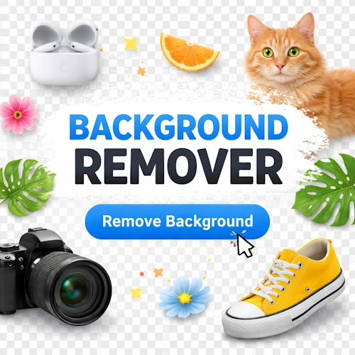
Background Remover
Remove a messy background so your curved text has a clean canvas to wrap around.

Overlay Images
Place your curved text design over other elements to build a multi-layered brand asset.

Blur / Sharpen
Blur the background slightly to make your curved text "pop" and be easier to read.
The Ethics of Digital Tools
We live in an age of automated design. There are AI tools that "guess" where your text should go. They use templates that thousands of other people are using. Your work ends up looking like everyone else's.
Our tool is different. It doesn't use AI to make choices for you. It gives you the sliders. It gives you the control. It requires your eye and your taste. This is "human-in-the-loop" design. It ensures that your curved text is unique to your image and your vision. Don't let an algorithm decide your brand's shape. Use your own hands.
Final thoughts
The FreeToolio Add Text Tool gives you full control over text shape directly in your browser. No AI. No templates. No shortcuts. Just direct, mathematical control over the geometry of your words.
If your text feels flat, a curve is the easiest way to fix it. It adds depth. It adds professional polish. It adds a level of design thinking that straight lines simply can't match.
Don't just type. Shape. Don't just place. Integrate. Make your words move with your world.